tuition_cost <- readr::read_csv('https://raw.githubusercontent.com/rfordatascience/tidytuesday/master/data/2020/2020-03-10/tuition_cost.csv')

salary_potential <- readr::read_csv('https://raw.githubusercontent.com/rfordatascience/tidytuesday/master/data/2020/2020-03-10/salary_potential.csv')Module 3 Assignment Solutions
Introduction
This is your assignment for Module 3 Data Exploration, focused on the material you learned in the lectures and recitation activities on data distributions, correlations, and annotating statistics.
Submission info:
- Please submit this assignment by uploading a knitted .html to Carmen
- Your headers should be logical and your report and code annotated with descriptions of what you’re doing
- Make sure you include the Code Download button so that I can see your code as well
- Customize the YAML and the document so you like how it looks
Remember there are often many ways to reach the same end product. I have showed you many ways in class to achieve a similar end product, you only need to show me one of them. As long as your answer is reasonable, you will get full credit even if its different than what I intended.
This assignment is due on Tuesday, October 29, 2024, at 11:59pm 👻🎃🕸
Data
The data we will be using was collected by the US Department of Education and collated by tuitiontracker.org. You can learn more about the data by going through the readme here.
For a little hint, here are the packages I used to complete this task. Yours might not be exactly the same.
library(scales)
library(ggridges)
library(ggdist)
library(ggpubr)
library(rstatix)
library(corrplot)
library(Hmisc)
library(tidyverse)
1. Data distributions visualization (3 pts)
Create a visualization that shows the distribution of tuition costs (both in_state_tuition and out_of_state_tuition) across public, private, and for-profit universities and colleges. You can use whatever type of plot you think is appropriate to show this distribution across different types of universities. Your plot should be publication ready quality.
Wrangle
# wrangle data to be in tidy format for in state and out of state tuition
# to facet, the faceting variable needs to be in one column
tuition_cost_tidy <- tuition_cost %>%
  pivot_longer(cols = c(in_state_tuition, out_of_state_tuition),
               names_to = "state_type",
               values_to = "tuition")
Adjust labels
# make a vector that has all the full names as wanted to appear in strip text
state_type_labels <- c("In state tuition", "Out of state tuition")

# tell state_type_labels which original label to refer to
names(state_type_labels) <- c("in_state_tuition", "out_of_state_tuition")
Plot
Density plot
I think this one is my favorite.
# plot
tuition_cost_tidy %>%
  filter(type != "Other") %>% # remove other as this isn't meaningful
  ggplot(aes(x = tuition, y = type, fill = type)) +
  stat_density_ridges(quantile_lines = TRUE,
                      quantiles = 2, # mark the median
                      alpha = 0.5) +
  scale_x_continuous(labels = dollar) + # make xaxis labels in dollar format
  scale_fill_brewer(palette = "Set2") +
  facet_wrap(vars(state_type), # facet by state_type and adjust labels
             labeller = labeller(state_type = state_type_labels)) +
  theme_minimal() +
  theme(legend.position = "none") +
  labs(x = "Yearly tuition, in US dollars",
       y = "Type of College/University",
       title = "Distribution of tuition costs for both in-state and out-of-state students \nacross public, private, and for-profit universities",
       caption = "Line represents the median yearly tuition")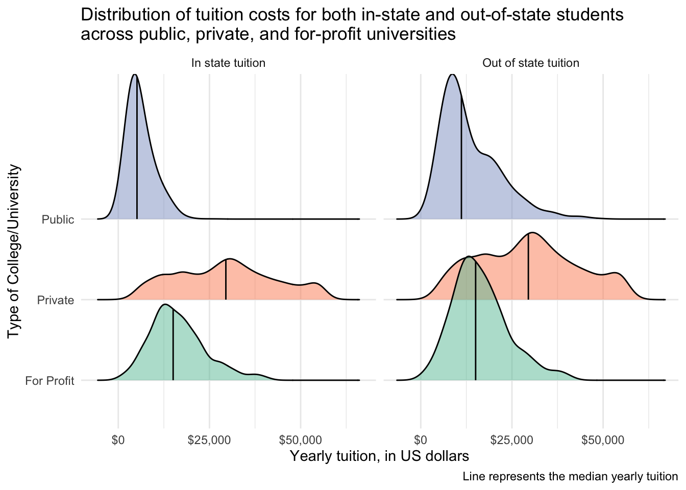
Could also instead facet by type. I divided tuition by 1000 to have the x-axis be in terms of thousands (i.e., K). A plot like this allows a better direct comparison between in and out of state, while the preious better allows a comparison between the types (i.e., public, for profit, private).
tuition_cost_tidy %>%
  filter(type != "Other") %>%
  ggplot(aes(x = tuition/1000, y = state_type, fill = state_type)) +
  stat_density_ridges(quantile_lines = TRUE,
                      quantiles = 2,
                      alpha = 0.5) +
  scale_x_continuous(labels = scales::dollar_format(prefix = "$", suffix = "K")) +
  scale_y_discrete(labels = c("In state tuition", "Out of state tuition")) +
  scale_fill_brewer(palette = "Set2") +
  facet_wrap(vars(type)) +
  theme_minimal() +
  theme(legend.position = "none") +
  labs(y = "Yearly tuition, in US dollars",
       x = "Type of College/University",
       title = "Distribution of tuition costs for both in-state and out-of-state students \nacross public, private, and for-profit universities",
       caption = "Line represents the median yearly tuition")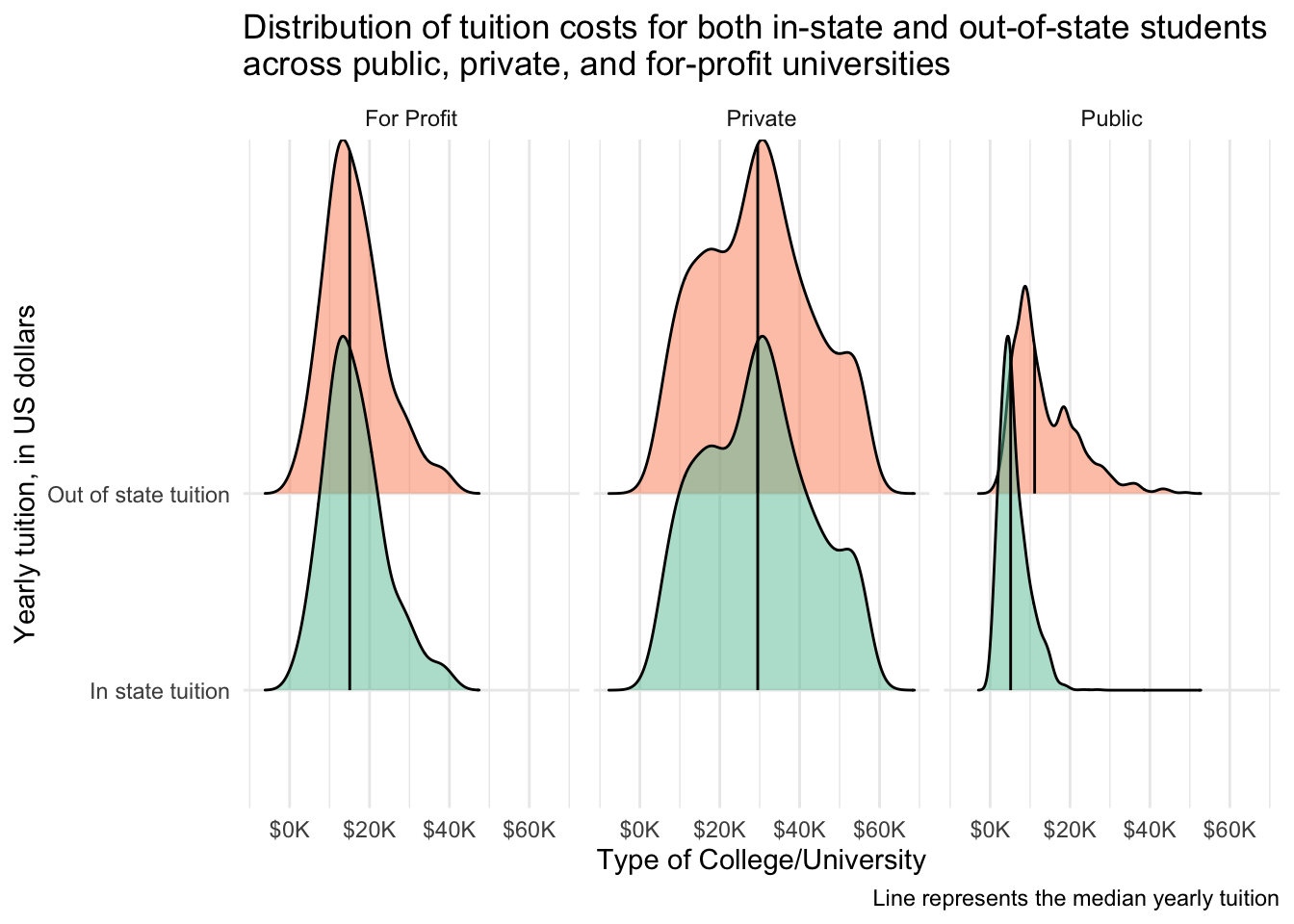
Boxplot with dots
# convert type to a factor and set levels
# i ordered from lowest mean tuition to highest
tuition_cost_tidy$type <- factor(tuition_cost_tidy$type,
                                 levels = c("Public", "For Profit", "Private"))

# plot
tuition_cost_tidy %>%
  filter(type != "Other") %>%
  ggplot(aes(x = type, y = tuition, color = type)) +
  geom_boxplot(outlier.shape = NA) +
  ggdist::geom_dots(side = "both", layout = "swarm") +
  scale_y_continuous(labels = dollar) +
  scale_color_brewer(palette = "Set2") +
  facet_wrap(vars(state_type),
             labeller = labeller(state_type = state_type_labels)) +
  theme_classic() +
  theme(legend.position = "none") +
  labs(x = "Yearly tuition, in US dollars",
       y = "Type of College/University",
       title = "Distribution of tuition costs for both in-state and out-of-state students \nacross public, private, and for-profit universities")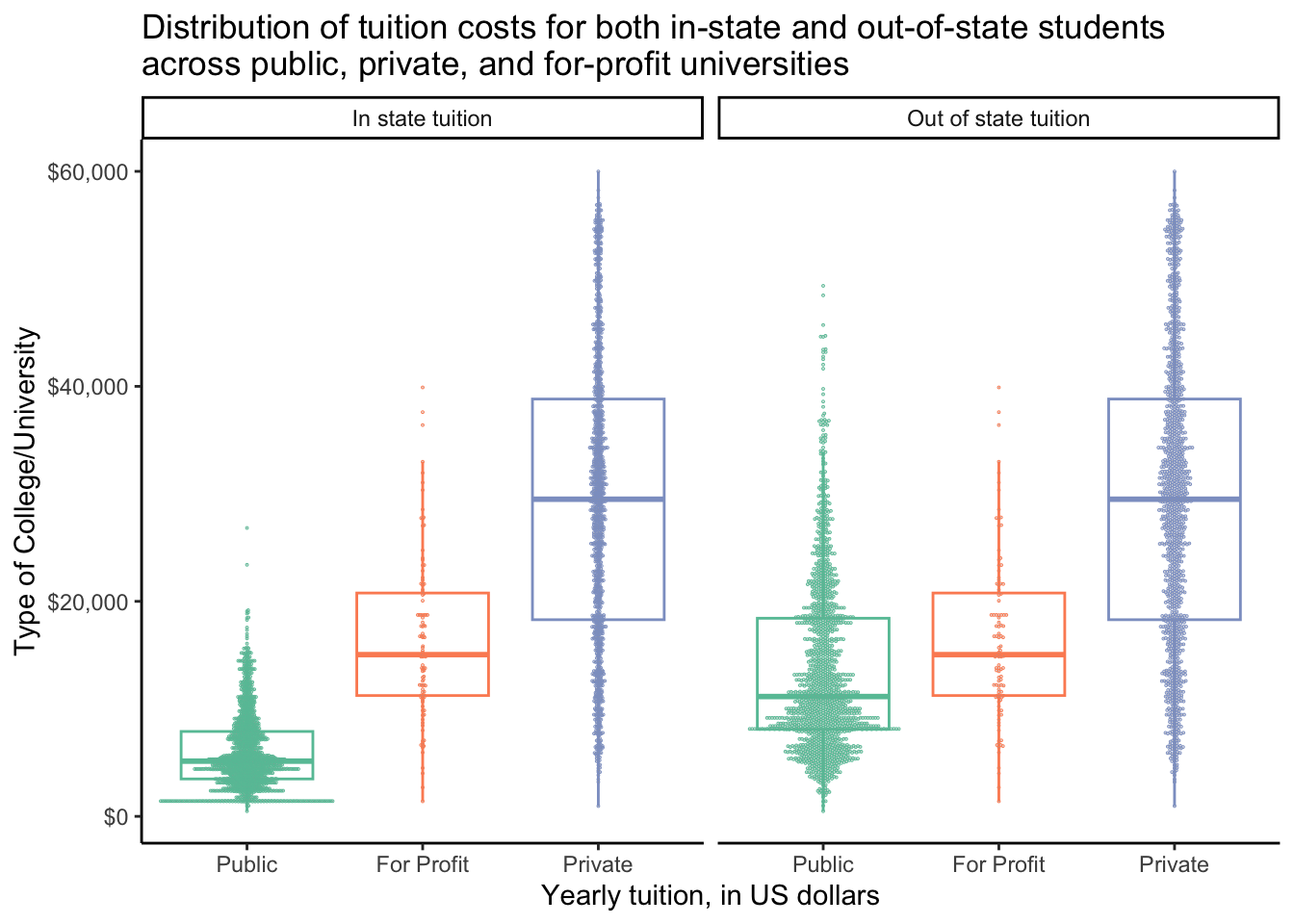
2. Adding statistics visualization (4 pts)
Make a plot that shows the difference in early_career_pay across private and public universities/colleges. Is there any statistical difference in pay across these two categories of institutions? Is the same true for mid_career_pay? This can be either one or two plots, its up to you. Make sure you are doing the right statistical test appropriate for your data.
Join tuition_cost and salary_potential
Here I am using left_join() to only include salary data that is present for universities in tuition_cost. You could use other types of joins and those would also work ok in this application.
salary_cost_join <- left_join(tuition_cost, salary_potential,
                              by = "name")
Investigatory plots
Wrangle.
# make column called pay_stage so can facet by career stage
salary_cost_join_tidy <- salary_cost_join %>%
  pivot_longer(cols = early_career_pay:mid_career_pay,
               names_to = "pay_stage",
               values_to = "pay")

salary_cost_join_tidy <- salary_cost_join_tidy %>%
  pivot_longer(cols = c(in_state_tuition, out_of_state_tuition),
               names_to = "in_or_out_of_state",
               values_to = "tuition")

# make a vector that has all the full names as wanted to appear in strip text
pay_stage_labels <- c("Early Career Pay", "Mid Career Pay")

# tell state_type_labels which original label to refer to
names(pay_stage_labels) <- c("early_career_pay", "mid_career_pay")
Facet based on pay_stage and in_or_out_of_state. Dividing the pay and tuition by 1000 to simplify axes, and then this change is reflected in the continuous scale functions.
# faceted plot
salary_cost_join_tidy %>%
  filter(type %in% c("Private", "Public")) %>%
  ggplot(aes(x = pay/1000, y = tuition/1000, color = type)) +
  geom_point(alpha = 0.5) +
  geom_smooth(method = "lm") +
  scale_x_continuous(labels = scales::dollar_format(prefix = "$", suffix = "K")) +
  scale_y_continuous(labels = scales::dollar_format(prefix = "$", suffix = "K")) +
  scale_color_manual(values = c("#fc8d62", "#8da0cb")) + # pick colors
  facet_grid(rows = vars(pay_stage), cols = vars(in_or_out_of_state),
             labeller = labeller(pay_stage = pay_stage_labels,
                                 in_or_out_of_state = state_type_labels)) +
  theme_classic() +
  theme(legend.position = "top") +
  labs(x = "Pay, in US Dollars",
       y = "Tuition, in US Dollars",
       title = "Relationship between career pay and tuition \nacross private and public US universities",
       color = "University type")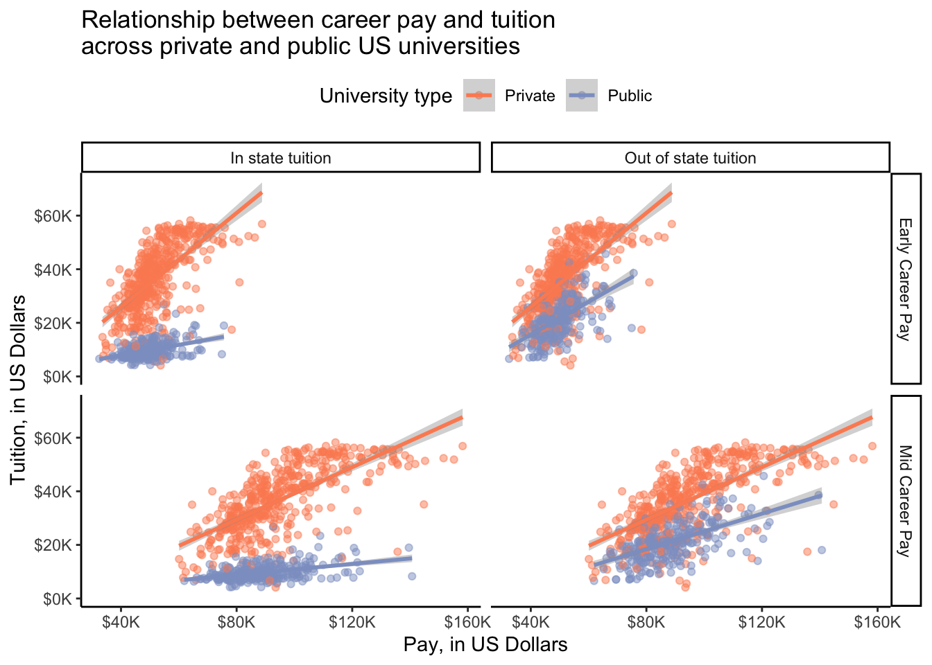
# early career pay only
salary_cost_join %>%
  filter(type %in% c("Private", "Public")) %>%
  ggplot(aes(x = early_career_pay, y = in_state_tuition, color = type)) +
  geom_point(alpha = 0.5) +
  geom_smooth(method = "lm") +
  stat_cor(method = "pearson") + # add correlation coefficient and pval
  scale_x_continuous(labels = dollar) + # convert y-axis labels to dollar format
  scale_y_continuous(labels = dollar) + # convert y-axis labels to dollar format
  scale_color_manual(values = c("#fc8d62", "#8da0cb")) + # pick colors
  theme_minimal() +
  labs(x = "Early Career Pay, in US Dollars",
       y = "In State Tuition, in US Dollars",
       title = "Relationship between early career pay and in state tuition \nacross private and public US universities",
       color = "University type")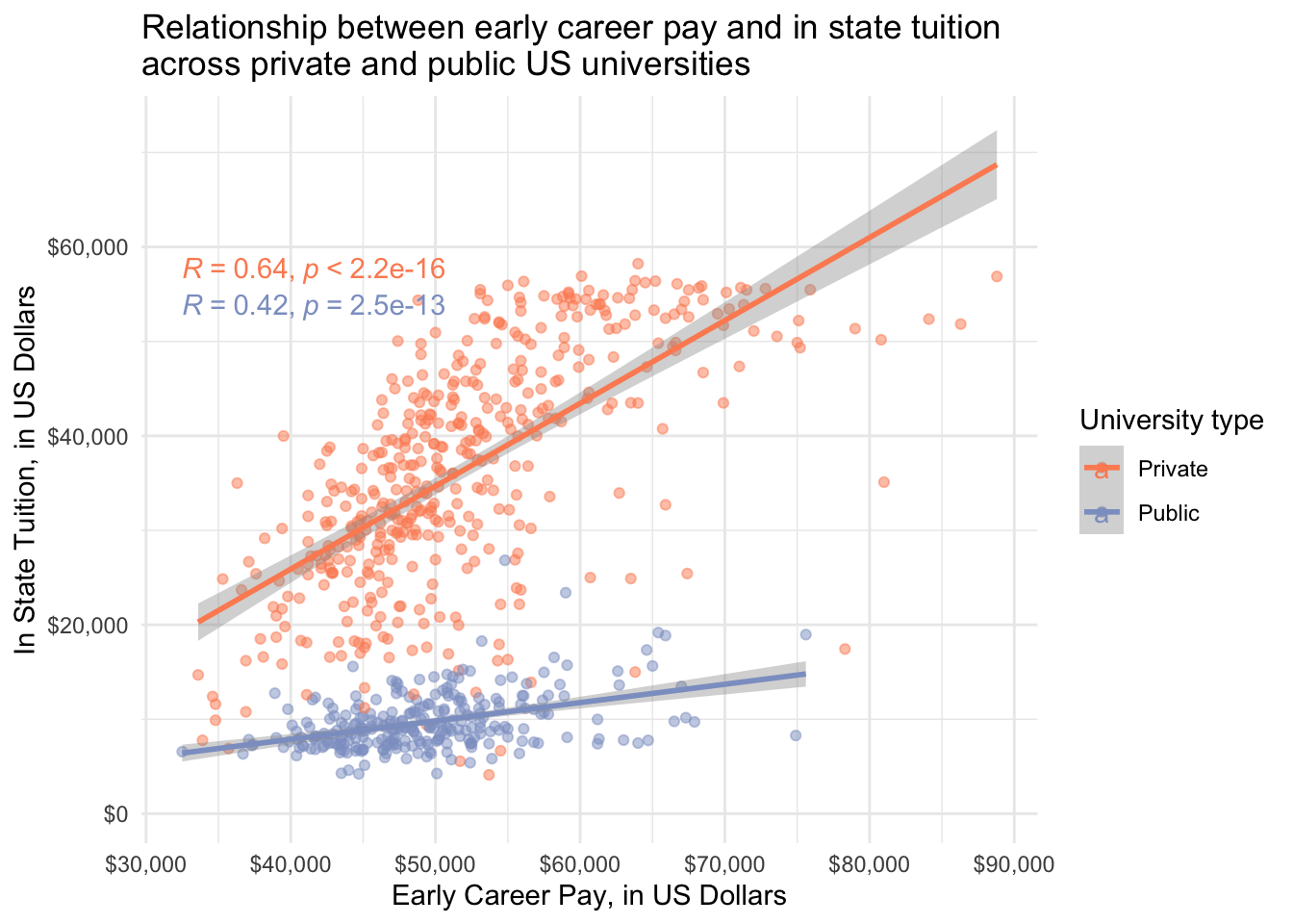
# mid career pay only
salary_cost_join %>%
  filter(type %in% c("Private", "Public")) %>%
  ggplot(aes(x = mid_career_pay, y = out_of_state_tuition, color = type)) +
  geom_point(alpha = 0.5) +
  geom_smooth(method = "lm") +
  stat_cor(method = "pearson") + # add correlation coefficient and pval
  scale_x_continuous(labels = dollar) + # convert y-axis labels to dollar format
  scale_y_continuous(labels = dollar) + # convert y-axis labels to dollar format
  scale_color_manual(values = c("#fc8d62", "#8da0cb")) + # pick colors
  theme_minimal() +
  labs(x = "Mid Career Pay, in US Dollars",
       y = "In State Tuition, in US Dollars",
       title = "Relationship between mid career pay and in state tuition \nacross private and public US universities",
       color = "University type")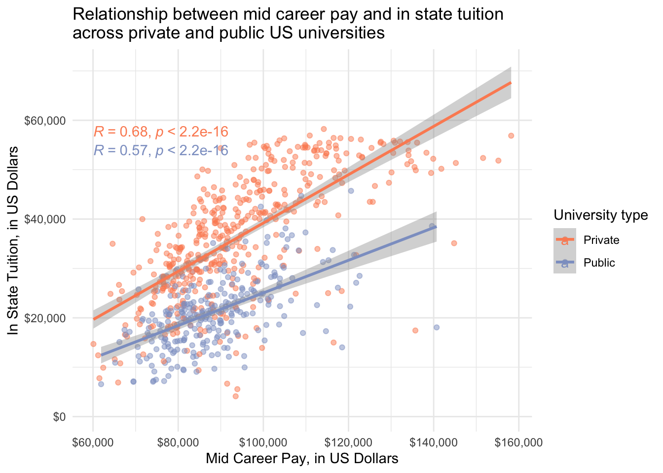
Test assumptions
Untransformed data.
# normality
salary_cost_join %>%
  filter(type %in% c("Private", "Public")) %>%
  drop_na(early_career_pay, mid_career_pay, type) %>% # remove NAs
  group_by(type) %>% # group by private vs public
  shapiro_test(early_career_pay,
               mid_career_pay) # test for normality
# A tibble: 4 × 4
type variable statistic p
<chr> <chr> <dbl> <dbl>
1 Private early_career_pay 0.951 4.83e-11
2 Private mid_career_pay 0.951 3.95e-11
3 Public early_career_pay 0.954 1.28e- 7
4 Public mid_career_pay 0.952 6.50e- 8# constant variance early_career_pay
salary_cost_join %>%
filter(type %in% c("Private", "Public")) %>%
drop_na(early_career_pay, mid_career_pay, type) %>% # remove NAs
levene_test(early_career_pay ~ type) # test for constant variance# A tibble: 1 × 4
df1 df2 statistic p
<int> <int> <dbl> <dbl>
1 1 725 18.2 0.0000223# constant variance mid_career_pay
salary_cost_join %>%
filter(type %in% c("Private", "Public")) %>%
drop_na(early_career_pay, mid_career_pay, type) %>% # remove NAs
levene_test(mid_career_pay ~ type) # test for constant variance# A tibble: 1 × 4
df1 df2 statistic p
<int> <int> <dbl> <dbl>
1 1 725 20.6 0.00000663Not normal and no constant variance. Non-parametric it is.
Wilcoxon test
# early career pay
salary_cost_join %>%
  filter(type != "For Profit") %>%
  drop_na(early_career_pay, type) %>% # remove NAs
  wilcox_test(early_career_pay ~ type,
              paired = FALSE)
# A tibble: 1 × 7
.y. group1 group2 n1 n2 statistic p
* <chr> <chr> <chr> <int> <int> <dbl> <dbl>
1 early_career_pay Private Public 451 276 72986. 0.0000918# mid career pay
salary_cost_join %>%
filter(type != "For Profit") %>%
drop_na(mid_career_pay, type) %>% # remove NAs
wilcox_test(mid_career_pay ~ type,
paired = FALSE)# A tibble: 1 × 7
.y. group1 group2 n1 n2 statistic p
* <chr> <chr> <chr> <int> <int> <dbl> <dbl>
1 mid_career_pay Private Public 451 276 74294 0.0000115Statistically significantly different early and mid career pay for people attending public vs private institutions.
Boxplot
Using stat_compare_means()
salary_cost_join %>%
  drop_na(type, early_career_pay) %>% # drop missing values for variables to plot
  filter(type %in% c("Private", "Public")) %>% # only private and public unis
  ggplot(aes(x = type, y = early_career_pay, fill = type)) +
  geom_boxplot(alpha = 0.5) + # boxplot
  scale_y_continuous(labels = dollar) + # convert y-axis labels to dollar format
  scale_fill_manual(values = c("#fc8d62", "#8da0cb")) + # pick colors
  stat_compare_means(label.y = 92000) + # run stats, indicate label position
  theme_minimal() +
  theme(legend.position = "none") +
  labs(x = "University type",
       y = "Early Career Pay, in US Dollars",
       title = "Differences in average early career pay across public \nand private US universities/colleges")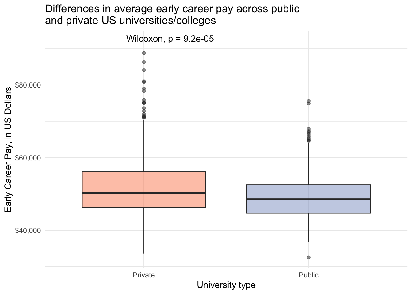
salary_cost_join %>%
  drop_na(type, mid_career_pay) %>%
  filter(type %in% c("Private", "Public")) %>%
  ggplot(aes(x = type, y = mid_career_pay, fill = type)) +
  geom_boxplot(alpha = 0.5) +
  scale_y_continuous(labels = dollar) +
  scale_fill_manual(values = c("#fc8d62", "#8da0cb")) +
  stat_compare_means(label.y = 163000) +
  theme_minimal() +
  theme(legend.position = "none") +
  labs(x = "University type",
       y = "Mid Career Pay, in US Dollars",
       title = "Differences in average mid career pay across public \nand private US universities/colleges")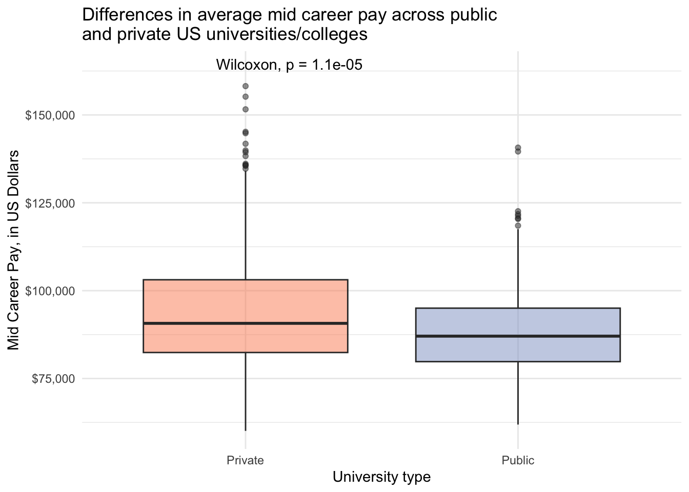
With annotate()
salary_cost_join %>%
  drop_na(type, early_career_pay) %>%
  filter(type %in% c("Private", "Public")) %>%
  ggplot(aes(x = type, y = early_career_pay, fill = type)) +
  geom_boxplot(alpha = 0.5) +
  scale_y_continuous(labels = dollar) +
  scale_fill_manual(values = c("#fc8d62", "#8da0cb")) +
  annotate(geom = "text", x = 2, y = 80000, label = "*", size = 8) +
  theme_minimal() +
  theme(legend.position = "none") +
  labs(x = "University type",
       y = "Early Career Pay, in US Dollars",
       title = "Differences in average early career pay across public \nand private US universities/colleges",
       caption = "Asterisks indicates a significant difference using the Wilcoxon Rank Sun test")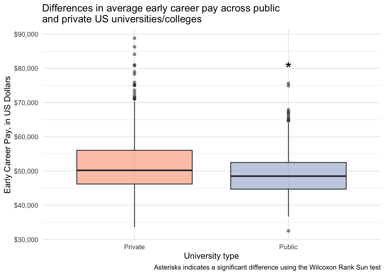
salary_cost_join %>%
  drop_na(type, mid_career_pay) %>%
  filter(type %in% c("Private", "Public")) %>%
  ggplot(aes(x = type, y = mid_career_pay, fill = type)) +
  geom_boxplot(alpha = 0.5) +
  scale_y_continuous(labels = dollar) +
  scale_fill_manual(values = c("#fc8d62", "#8da0cb")) +
  annotate(geom = "text", x = 2, y = 145000, label = "*", size = 8) +
  theme_minimal() +
  theme(legend.position = "none") +
  labs(x = "University type",
       y = "Mid Career Pay, in US Dollars",
       title = "Differences in average mid career pay across public \nand private US universities/colleges",
       caption = "Asterisks indicates a significant difference using the Wilcoxon Rank Sun test")
With geom_text()
salary_cost_join %>%
  drop_na(type, early_career_pay) %>%
  filter(type %in% c("Private", "Public")) %>%
  ggplot(aes(x = type, y = early_career_pay, fill = type)) +
  geom_boxplot(alpha = 0.5) +
  scale_y_continuous(labels = dollar) +
  scale_fill_manual(values = c("#fc8d62", "#8da0cb")) +
  geom_text(aes(x = 2, y = 80000, label = "*"), size = 8) +
  theme_minimal() +
  theme(legend.position = "none") +
  labs(x = "University type",
       y = "Early Career Pay, in US Dollars",
       title = "Differences in average early career pay across public \nand private US universities/colleges",
       caption = "Asterisks indicates a significant difference using the Wilcoxon Rank Sun test")
salary_cost_join %>%
  drop_na(type, mid_career_pay) %>%
  filter(type %in% c("Private", "Public")) %>%
  ggplot(aes(x = type, y = mid_career_pay, fill = type)) +
  geom_boxplot(alpha = 0.5) +
  scale_y_continuous(labels = dollar) +
  scale_fill_manual(values = c("#fc8d62", "#8da0cb")) +
  geom_text(aes(x = 2, y = 145000, label = "*"), size = 8) +
  theme_minimal() +
  theme(legend.position = "none") +
  labs(x = "University type",
       y = "Mid Career Pay, in US Dollars",
       title = "Differences in average mid career pay across public \nand private US universities/colleges",
       caption = "Asterisks indicates a significant difference using the Wilcoxon Rank Sun test")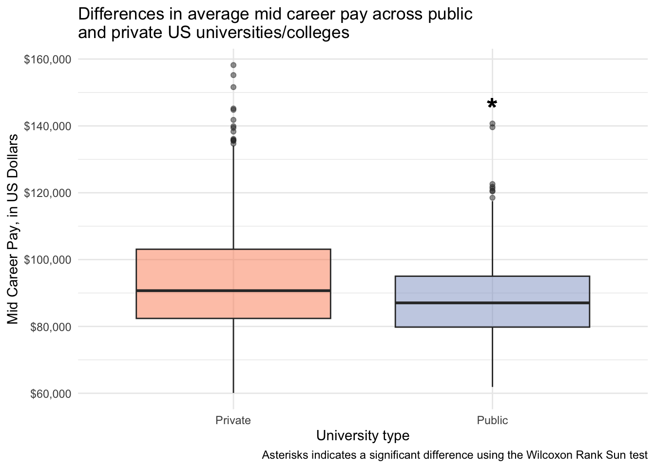
And a faceted plot
I learned how to use geom_text() and geom_segment() to add stats annotation on a faceted plot with the help of this blog post. First I create a dataframe that includes the coordinates of where the segments and text should go, and then I make the plot.
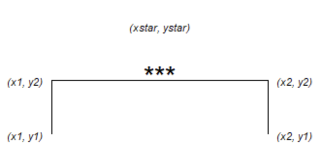
This image helps you to see what the different variables are.
# create a dataframe that includes
text_to_plot <- data.frame(
  x1 = c(1, 1), x2 = c(2, 2),
  y1 = c(100000, 170000), y2 = c(120000, 190000),
  xstar = c(1.5, 1.5), ystar = c(130000, 200000),
  label = c("*", "*"),
  pay_stage = c("early_career_pay", "mid_career_pay")
)

salary_cost_join_tidy %>%
  drop_na(type, pay_stage, pay) %>%
  filter(type %in% c("Private", "Public")) %>%
  ggplot(aes(x = type, y = pay, fill = pay_stage)) +
  geom_boxplot(alpha = 0.5) +
  scale_x_discrete(labels = c("Private", "Public")) +
  scale_y_continuous(labels = dollar) +
  scale_fill_manual(values = c("#fc8d62", "#8da0cb")) +
  facet_wrap(vars(pay_stage),
             labeller = labeller(pay_stage = pay_stage_labels)) +
  geom_text(data = text_to_plot,
            aes(x = xstar,  y = ystar, label = label), size = 8) +
  geom_segment(data = text_to_plot,
               aes(x = x1, xend = x1,
                   y = y1, yend = y2), color = "black") +
  geom_segment(data = text_to_plot,
               aes(x = x2, xend = x2,
                   y = y1, yend = y2), color = "black") +
  geom_segment(data = text_to_plot,
               aes(x = x1, xend = x2,
                   y = y2, yend = y2), color = "black") +
  theme_minimal() +
  theme(legend.position = "none") +
  ylim(c(0, 210000)) +
  labs(x = "University Type",
       y = "Yearly Pay, in US Dollars",
       title = "Differences in early and mid career pay across public \nand private US universities/colleges",
       caption = "Asterisks indicates a significant difference using the Wilcoxon Rank Sun test")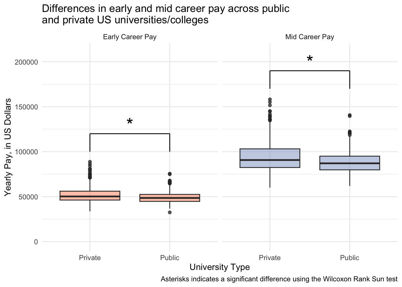
Dotplot
Using stat_compare_means()
salary_cost_join %>%
  drop_na(type, early_career_pay) %>% # drop missing values for variables to plot
  filter(type %in% c("Private", "Public")) %>% # only private and public unis
  ggplot(aes(x = type, y = early_career_pay, fill = type)) +
  stat_dotsinterval(side = "both", layout = "swarm") +
  scale_y_continuous(labels = dollar) + # convert y-axis labels to dollar format
  scale_fill_manual(values = c("#fc8d62", "#8da0cb")) + # pick colors
  stat_compare_means(label.y = 92000) + # run stats, indicate label position
  theme_minimal() +
  theme(legend.position = "none") +
  labs(x = "University type",
       y = "Early Career Pay, in US Dollars",
       title = "Differences in average early career pay across public \nand private US universities/colleges")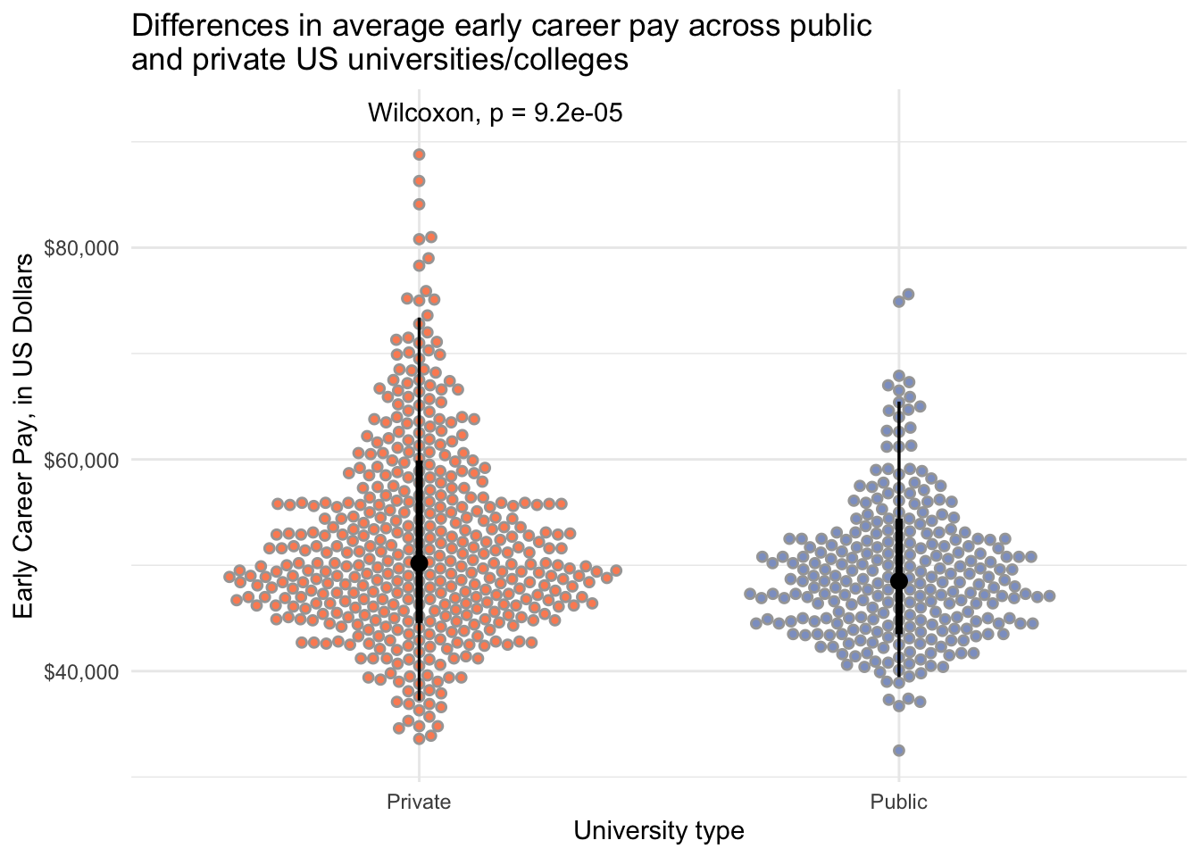
salary_cost_join %>%
  drop_na(type, mid_career_pay) %>%
  filter(type %in% c("Private", "Public")) %>%
  ggplot(aes(x = type, y = mid_career_pay, fill = type)) +
  stat_dotsinterval(side = "both", layout = "swarm") +
  scale_y_continuous(labels = dollar) +
  scale_fill_manual(values = c("#fc8d62", "#8da0cb")) +
  stat_compare_means(label.y = 163000) +
  theme_minimal() +
  theme(legend.position = "none") +
  labs(x = "University type",
       y = "Mid Career Pay, in US Dollars",
       title = "Differences in average mid career pay across public \nand private US universities/colleges")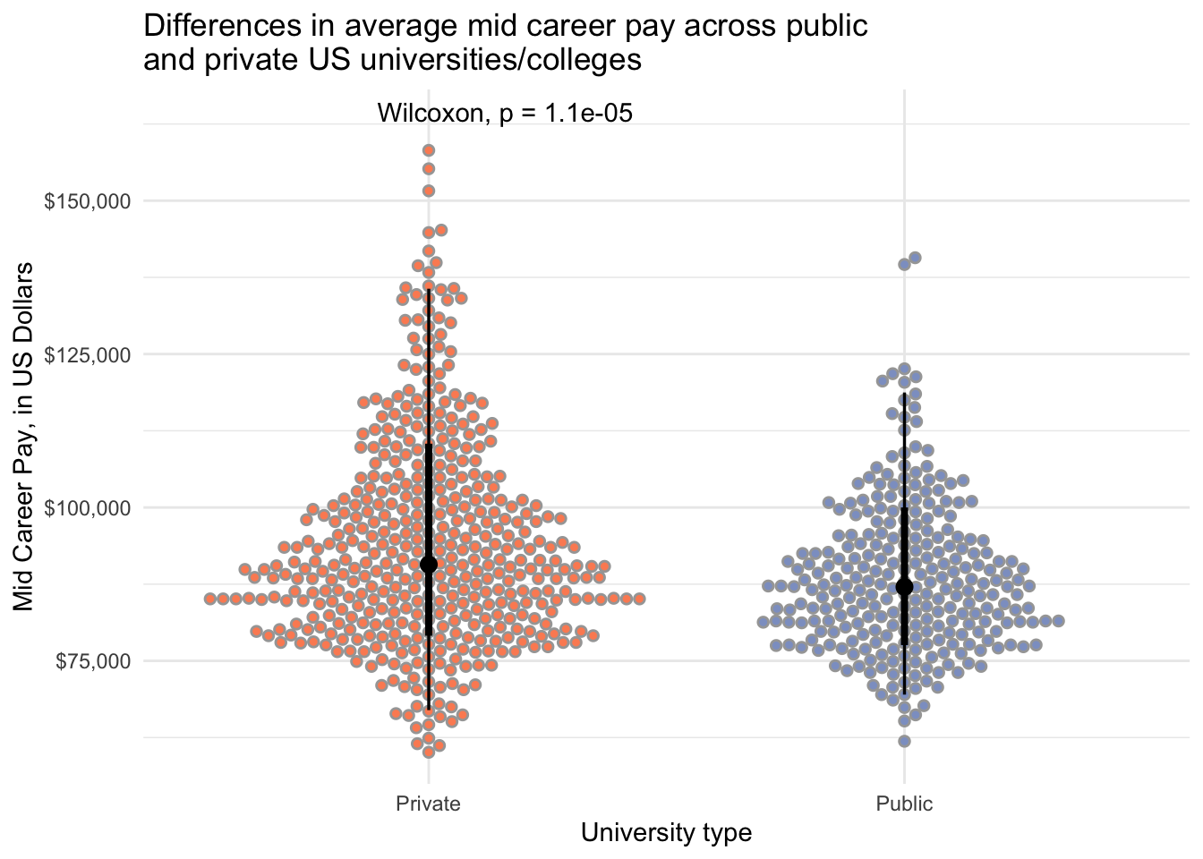
With annotate()
salary_cost_join %>%
  drop_na(type, early_career_pay) %>%
  filter(type %in% c("Private", "Public")) %>%
  ggplot(aes(x = type, y = early_career_pay, fill = type)) +
  stat_dotsinterval(side = "both", layout = "swarm") +
  scale_y_continuous(labels = dollar) +
  scale_fill_manual(values = c("#fc8d62", "#8da0cb")) +
  annotate(geom = "text", x = 2, y = 80000, label = "*", size = 8) +
  theme_minimal() +
  theme(legend.position = "none") +
  labs(x = "University type",
       y = "Early Career Pay, in US Dollars",
       title = "Differences in average early career pay across public \nand private US universities/colleges",
       caption = "Asterisks indicates a significant difference using the Wilcoxon Rank Sun test")
salary_cost_join %>%
  drop_na(type, mid_career_pay) %>%
  filter(type %in% c("Private", "Public")) %>%
  ggplot(aes(x = type, y = mid_career_pay, fill = type)) +
  stat_dotsinterval(side = "both", layout = "swarm") +
  scale_y_continuous(labels = dollar) +
  scale_fill_manual(values = c("#fc8d62", "#8da0cb")) +
  annotate(geom = "text", x = 2, y = 145000, label = "*", size = 8) +
  theme_minimal() +
  theme(legend.position = "none") +
  labs(x = "University type",
       y = "Mid Career Pay, in US Dollars",
       title = "Differences in average mid career pay across public \nand private US universities/colleges",
       caption = "Asterisks indicates a significant difference using the Wilcoxon Rank Sun test")
With geom_text()
salary_cost_join %>%
  drop_na(type, early_career_pay) %>%
  filter(type %in% c("Private", "Public")) %>%
  ggplot(aes(x = type, y = early_career_pay, fill = type)) +
  stat_dotsinterval(side = "both", layout = "swarm") +
  scale_y_continuous(labels = dollar) +
  scale_fill_manual(values = c("#fc8d62", "#8da0cb")) +
  geom_text(aes(x = 2, y = 80000, label = "*"), size = 8) +
  theme_minimal() +
  theme(legend.position = "none") +
  labs(x = "University type",
       y = "Early Career Pay, in US Dollars",
       title = "Differences in average early career pay across public \nand private US universities/colleges",
       caption = "Asterisks indicates a significant difference using the Wilcoxon Rank Sun test")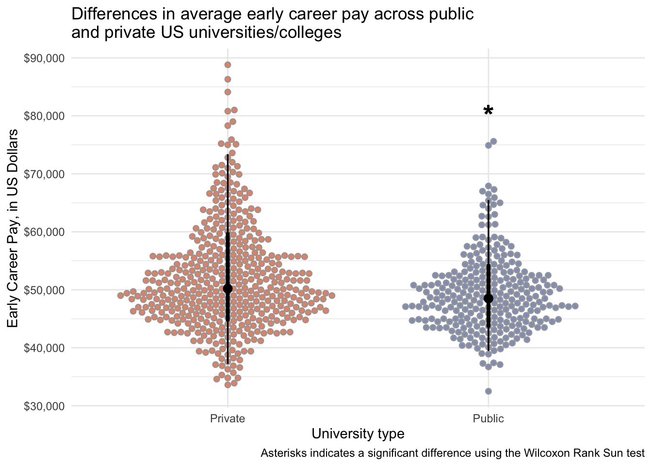
salary_cost_join %>%
  drop_na(type, mid_career_pay) %>%
  filter(type %in% c("Private", "Public")) %>%
  ggplot(aes(x = type, y = mid_career_pay, fill = type)) +
  stat_dotsinterval(side = "both", layout = "swarm") +
  scale_y_continuous(labels = dollar) +
  scale_fill_manual(values = c("#fc8d62", "#8da0cb")) +
  geom_text(aes(x = 2, y = 145000, label = "*"), size = 8) +
  theme_minimal() +
  theme(legend.position = "none") +
  labs(x = "University type",
       y = "Mid Career Pay, in US Dollars",
       title = "Differences in average mid career pay across public \nand private US universities/colleges",
       caption = "Asterisks indicates a significant difference using the Wilcoxon Rank Sun test")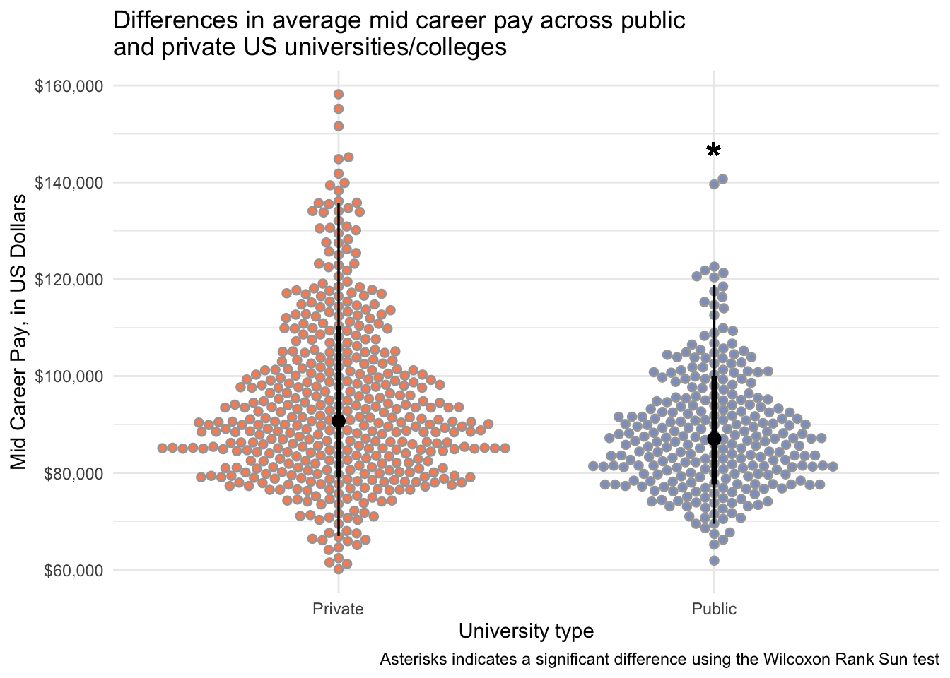
Could also make violin plots or histograms.
3. Understanding correlations visualization (3 pts)
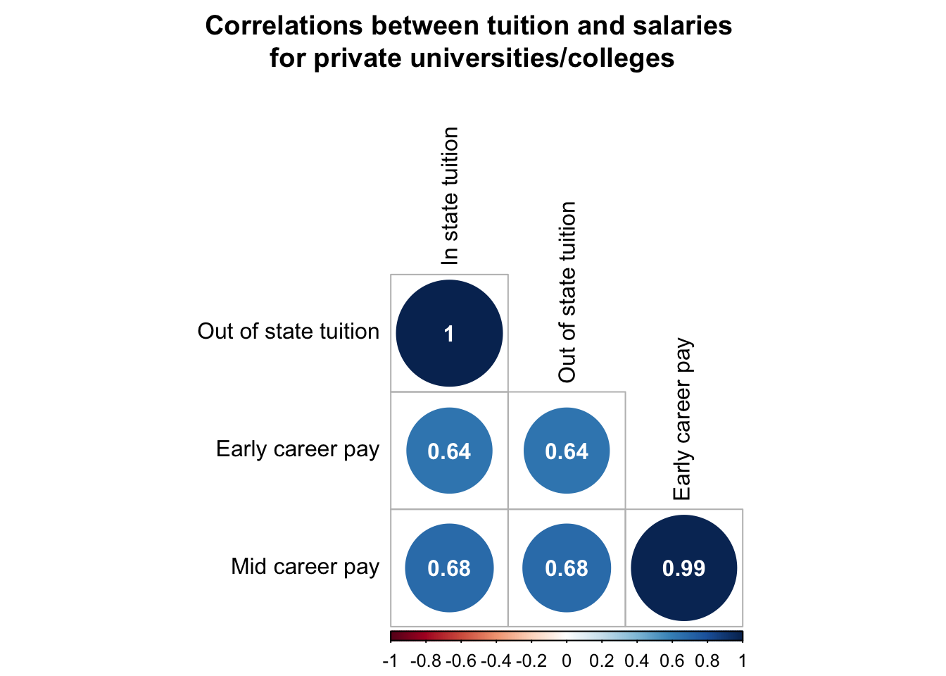
Make a visualization that investigates and then visualizes correlation between early_career_pay, mid_career_pay and university tuition (both in state and out of state) showing correlation coefficients. Show how this is different across public and private universities. If you feel like you want to make a couple plots to display this relationship, that is fine.
Wrangling
I want to pick only the variables to include in the correlation analysis, get rid of missing values, and make it into a matrix (as rcorr() needs a matrix).
# create matrix for correlation
to_rcorr_public <- salary_cost_join %>%
  filter(type == "Public") %>%
  select(in_state_tuition, out_of_state_tuition, early_career_pay, mid_career_pay) %>%
  drop_na() %>%
  as.matrix() # rcorr() needs a matrix

# create matrix for correlation
to_rcorr_private <- salary_cost_join %>%
  filter(type == "Private") %>%
  select(in_state_tuition, out_of_state_tuition, early_career_pay, mid_career_pay) %>%
  drop_na() %>%
  as.matrix() # rcorr() needs a matrix
Create correlation matrix with pvalues.
I’m doing two separate correlations, for both private and public institutions.
# create a correlation matrix that includes the pvalues for the correlations
public_rcorr <- rcorr(to_rcorr_public, type = "pearson")
private_rcorr <- rcorr(to_rcorr_private, type = "pearson")
Get labels set up
# create a vector of the alkaloid names for labeling
axis_labels <- c("In state tuition",
                 "Out of state tuition",
                 "Early career pay",
                 "Mid career pay")

# change row and column names of the correlation matrix
# so they are how we want them to be plotted
colnames(public_rcorr$r) <- axis_labels
rownames(public_rcorr$r) <- axis_labels
colnames(private_rcorr$r) <- axis_labels
rownames(private_rcorr$r) <- axis_labels

# change row and column names of the pvalue matrix
# so they are how we want them to be plotted
colnames(public_rcorr$P) <- axis_labels
rownames(public_rcorr$P) <- axis_labels
colnames(private_rcorr$P) <- axis_labels
rownames(private_rcorr$P) <- axis_labels
Plot
# plot public
corrplot(public_rcorr$r, # the correlation matrix
         type = "lower", # lower triangle
         tl.col = "black", # axis labels are black
         p.mat  = public_rcorr$P, # pvalue matrix
         sig.level = 0.05, # how sig does a cor need to be to be included
         insig = "blank", # do not display insignificant correlations
         addCoef.col = "white", # display correlations in black
         diag = FALSE, # don't show the diagonal (because this is all 1)
         number.cex = 1, # size of correlation font
         title = "Correlations between tuition and salaries \nfor public universities/colleges", # indicate title
         mar = c(0,0,3,0)) # move title down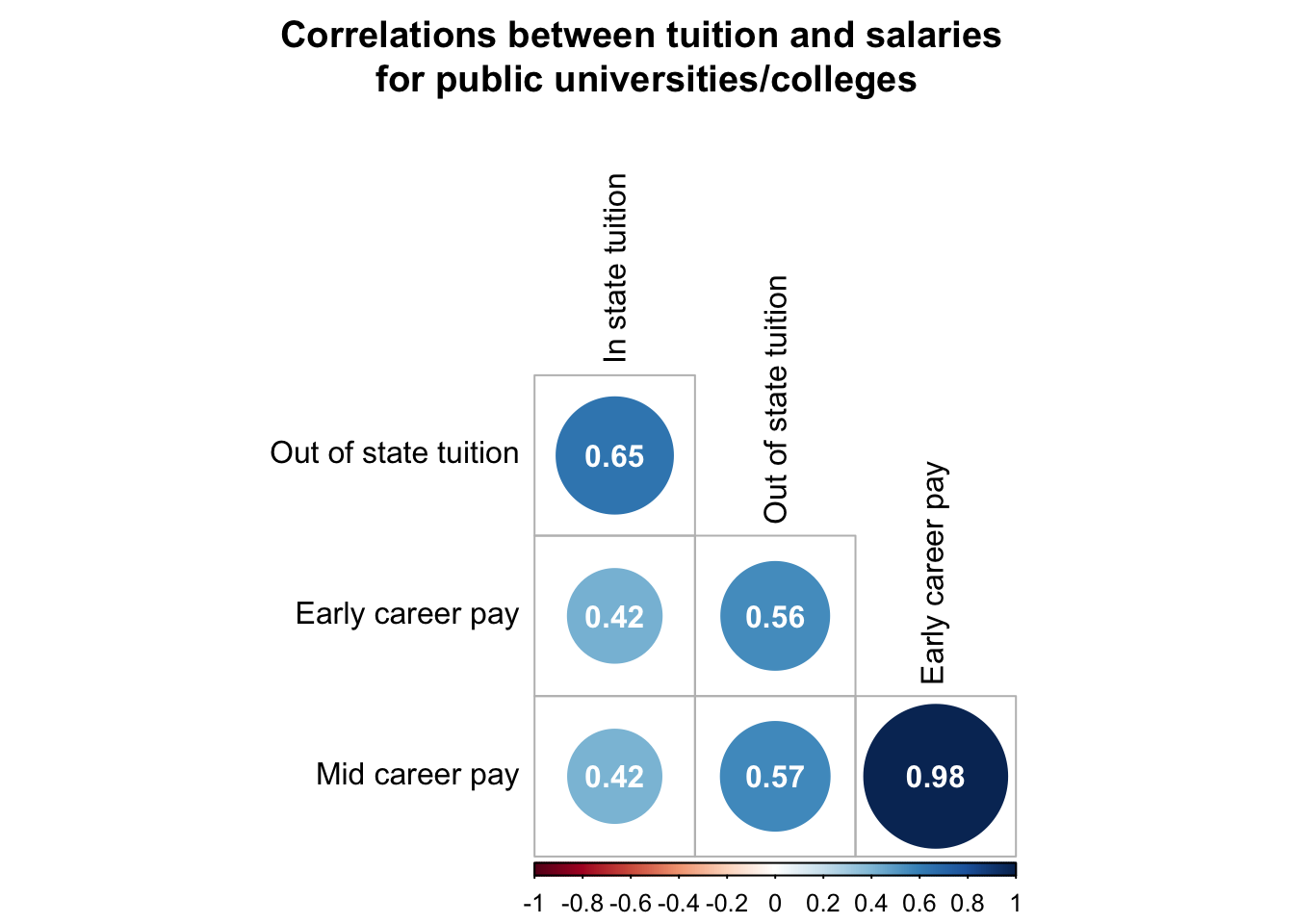
# plot private
corrplot(private_rcorr$r, # the correlation matrix
         type = "lower", # lower triangle
         tl.col = "black", # axis labels are black
         p.mat  = private_rcorr$P, # pvalue matrix
         sig.level = 0.05, # how sig does a cor need to be to be included
         insig = "blank", # do not display insignificant correlations
         addCoef.col = "white", # display correlations in black
         diag = FALSE, # don't show the diagonal (because this is all 1)
         number.cex = 1, # size of correlation font
         title = "Correlations between tuition and salaries \nfor private universities/colleges", # indicate title
         mar = c(0,0,3,0)) # move title down