library(tidyverse) # for everything
library(gghighlight) # for highlighting
library(gganimate) # animating plots
library(ggrepel) # for text/label repelling
library(magick) # for gif rendering
library(scales) # for easy scaling
library(plotly) # for ggplotly
library(glue) # for easy pasting

library(gapminder) # for data for viz2Leftover tidbits recitation solutions
Week 13
Introduction
Today’s recitation materials are on a bunch of stuff I thought was interesting but didn’t fit specifically into any of the other lessons. This includes some cool ggplot extension packages we haven’t gone over yet, and heatmaps that utilize base R plotting.
Load libraries
Loading the libraries that are for each section. Individual libraries are before each section so you can see which go with what plot types.
Really start using an Rproject 📽️

If you don’t have a Rproject for class, set one up.
Visualization 1
We are going to interrogate a dataset from Gapminder that includes information about Happiness Scores collected across different countries and years.
Create a visualization that shows the happiness scores for all countries from 2008 to 2010. Highlight in some way the top 3 countries with the highest happiness scores per continent.
I’ve put the data on Github so you can easily download it with the code below. Note, the question asks you to make a plot considering continent so I’ve also provided you a key that has each country, and the continent to which it belows for you to join together.
happiness <- read_csv("https://github.com/jcooperstone/dataviz-site/raw/master/4_12_leftovers/data/hapiscore_whr.csv")Rows: 163 Columns: 18
── Column specification ────────────────────────────────────────────────────────
Delimiter: ","
chr (1): country
dbl (17): 2004, 2005, 2006, 2007, 2008, 2009, 2010, 2011, 2012, 2013, 2014, ...
ℹ Use `spec()` to retrieve the full column specification for this data.
ℹ Specify the column types or set `show_col_types = FALSE` to quiet this message.country_continent <- read_csv("https://github.com/jcooperstone/dataviz-site/raw/master/4_12_leftovers/data/country_continent.csv")Rows: 234 Columns: 2
── Column specification ────────────────────────────────────────────────────────
Delimiter: ","
chr (2): country, continent
ℹ Use `spec()` to retrieve the full column specification for this data.
ℹ Specify the column types or set `show_col_types = FALSE` to quiet this message.Wrangle
# join happiness and country_continent
# so we can see which continent goes which each country
happiness_country <- left_join(happiness, country_continent, by = "country")

# make tidy data and convert year from character to numeric
happiness_tidy <- happiness_country %>%
  pivot_longer(cols = -c(country, continent),
               names_to = "year",
               values_to = "rating") %>%
  mutate(year = as.numeric(year))
# create a df that has the maximum happiness rating across the time
# period per country by continent
max_happiness <- happiness_tidy %>%
filter(year %in% c(2008:2020)) %>%
drop_na(rating) %>%
group_by(continent, country) %>%
summarize(max_rating = max(rating)) `summarise()` has grouped output by 'continent'. You can override using the
`.groups` argument.head(max_happiness)# A tibble: 6 × 3
# Groups: continent [1]
continent country max_rating
<chr> <chr> <dbl>
1 Africa Algeria 63.5
2 Africa Angola 55.9
3 Africa Benin 58.2
4 Africa Botswana 48.4
5 Africa Burkina Faso 49.3
6 Africa Burundi 37.9# pull the top 3 happiness countries for each continent
top3_happiest <- max_happiness %>%
ungroup() %>% # to get rid of grouping from previous chunk
group_by(continent) %>%
slice_max(max_rating, n = 3) %>%
ungroup() # then ungroup again
top3_happiest# A tibble: 17 × 3
continent country max_rating
<chr> <chr> <dbl>
1 Africa Algeria 63.5
2 Africa Mauritius 62.4
3 Africa Benin 58.2
4 Asia Israel 74.3
5 Asia United Arab Emirates 72.2
6 Asia Bahrain 71
7 Europe Finland 78.9
8 Europe Denmark 77.9
9 Europe Switzerland 77.8
10 North America Canada 76.5
11 North America Costa Rica 76.2
12 North America Mexico 74.4
13 Oceania Australia 74.5
14 Oceania New Zealand 74.2
15 South America Venezuela 74.8
16 South America Brazil 71.4
17 South America Chile 68.4Plot
happiness_tidy %>%
  filter(year %in% c(2008:2020)) %>%
  ggplot(aes(x = year, y = rating, group = country, color = continent)) +
  geom_line() +
  scale_x_continuous(breaks = seq(2004, 2020, 4)) +
  gghighlight(country %in% top3_happiest$country,
              label_params = list(size = 3)) +
  facet_wrap(vars(continent)) +
  theme_classic() +
  theme(legend.position = "none",
        axis.text.x = element_text(angle = 45, # text on 45degree angle
                                   margin = margin(t = 8))) + # padding on axis text
  labs(x = "Year",
       y = "Happiness Rating (out of 100)",
       title = "Happiness ratings for each country by continent over 2008 to 2020",
       subtitle = "Data from Gapminder.org")
Visualization 2
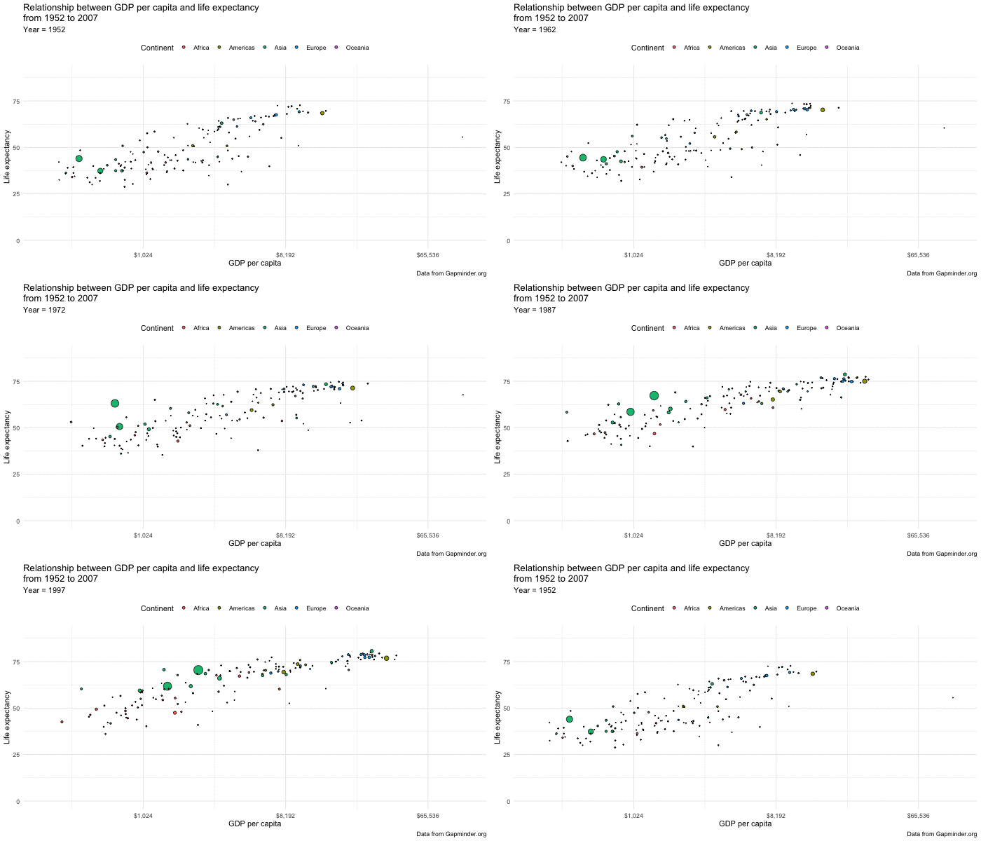
Recreate a plot in the vein of the one here. You can make the same interactive plot (use the data from 2007, which is slightly older and different from what you see in the online plot), or choose to animate it over year. Or do both.
Use the data gapminder::gapminder which you can access from R.
Interactive
glimpse(gapminder)Rows: 1,704
Columns: 6
$ country <fct> "Afghanistan", "Afghanistan", "Afghanistan", "Afghanistan", …
$ continent <fct> Asia, Asia, Asia, Asia, Asia, Asia, Asia, Asia, Asia, Asia, …
$ year <int> 1952, 1957, 1962, 1967, 1972, 1977, 1982, 1987, 1992, 1997, …
$ lifeExp <dbl> 28.801, 30.332, 31.997, 34.020, 36.088, 38.438, 39.854, 40.8…
$ pop <int> 8425333, 9240934, 10267083, 11537966, 13079460, 14880372, 12…
$ gdpPercap <dbl> 779.4453, 820.8530, 853.1007, 836.1971, 739.9811, 786.1134, …income_by_lifeexp <- gapminder %>%
filter(year == 2007) %>%
ggplot(aes(gdpPercap, y = lifeExp, fill = continent, size = pop,
# set hover text
text = glue("Country: {country}
Continent: {continent}
GDP per capita: ${round(gdpPercap, 0)}
Life expectancy: {round(lifeExp, 0)}"))) +
geom_point(shape = 21, color = "black") +
scale_x_continuous(trans = "log2", labels = scales::dollar_format()) +
scale_size_area(guide = "none") +
coord_cartesian(ylim = c(0, 90)) +
theme_minimal() +
theme(legend.position = "top") +
labs(x = "GDP per capita",
y = "Life expectancy",
fill = "Continent",
title = "Relationship between GDP per capita and life expectancy
from 1952 to 2007",
caption = "Data from Gapminder.org")
ggplotly(income_by_lifeexp, tooltip = "text")Animated
income_by_lifeexp_anim <- gapminder %>%
  ggplot(aes(gdpPercap, y = lifeExp, fill = continent, size = pop,
             text = glue("Country: {country}
                         Continent: {continent}
                         GDP per capita: ${round(gdpPercap, 0)}
                         Life expectancy: {round(lifeExp, 0)}"))) +
  geom_point(shape = 21, color = "black") +
  scale_x_continuous(trans = "log2", labels = scales::dollar_format()) +
  scale_size_area(guide = "none") +
  coord_cartesian(ylim = c(0, 90)) +
  theme_minimal() +
  theme(legend.position = "top") +
  labs(x = "GDP per capita",
       y = "Life expectancy",
       fill = "Continent",
       title = "Relationship between GDP per capita and life expectancy
from 1952 to 2007",
       subtitle = "Year = {closest_state}",
       caption = "Data from Gapminder.org") +
  transition_states(year)

# set parameters for your animation
(animated_plot <- animate(plot = income_by_lifeexp_anim,
                        duration = 10,
                        fps = 10,
                        width = 700,
                        height = 400,
                        renderer = magick_renderer()))